Brakpan
| Heraldry of the World |
| South Africa heraldry portal Civic heraldry of South Africa |
|
BRAKPAN
Province: Gauteng
District Municipality : Ekurhuleni
Official blazon
- (af)
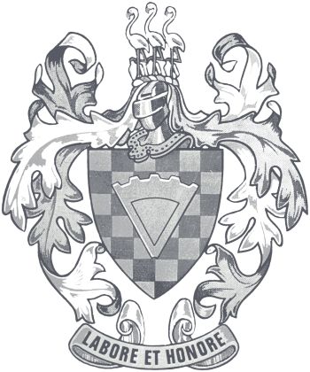
Wapen: Geskaak van silwer en groen; oor alles heen 'n segment van 'n tandrat van goud.
Helmteken: Drie flaminke van natuurlike kleur, elk met die regterpoot rustende op 'n stamper van goud.
Wrong en Dekklede: Goud en groen.
Wapenspreuk: LABORE ET HONORE
- (en)
Arms: Checky Argent and Vert; over all a segment of a cogwheel Or.
Crest: Three flamingoes proper, the dexter foot of each resting on a gold stamp Or.
Wreath and mantling: Or and Vert.
Motto: LABORE ET HONORE
Origin/meaning
The arms were officially granted on November 22, 1967.
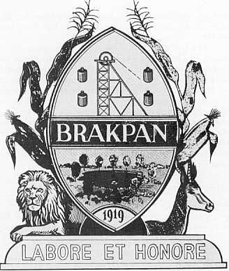
The municipal coat of arms approved by the Brakpan Town Council on March 23, 1920 and was not of sound heraldic design, see image below.
The design showed in the upper part symbols for the importance of gold mining for the development of the town and in the base a canting 'brakke pan' ('brackisch pond') and the name of the municipality in a bar in the middle. The shield shape was a Zulu type shield, even though the town was not in historical Zulu territory. The arms are surrounded by typical wildlife and agricultural crops. The lion and the springbok also symbolise the English and Afrikaans speaking inhabitants respectively.
The design was used, but in 1959 the Heraldry Society of Southern Africa called upon the Council to change the arms for a proposed exhibition of municipal coats of arms during the Union festival (1960). As the design was non heraldic, it could not be included in the festival. The Council nevertheless decided to retain its coat of arms as it had become part of the town's tradition. Still they asked the Heraldry Society for comments on the design. These comments were extensive.. both on the shield shape, the different components and also in the two animals. In the end the result was that the 'traditional' design was shown on the exhibition and nothing changed. They reasoned that the design was clearly showing the history of the town, better as the heraldic arms of the surrounding towns. And why should a 'bunch of heraldists' decide on the town's symbolism ?
When a new building for the Transvaal provincial administration was to be erected, it was decided that only municipal coats of arms of sound heraldic design would be displayed in this building. Thus the Council was forced to reconsider its design, ór it would not be represented at all in the building. After a long consultation with the State Herald, the Council had new heraldic bearings designed, which were finally registered and approved.
The new arms show a checky field and a piece of a cogwheel. Together with the stamps in the crest, this referred to the mining in the area, which by the time (in 1964) had already ceased to exist and the mines were closed. The flamingoes in the crest were chosen as a typical bird for the original pond and thus symbolise the name of the town. In an earlier version, two flamingoes were prpoposed as supporters, but this was not finalised. All other former elements were eliminated.
Contact and Support
Partners:
Your logo here ?
Contact us
© since 1995, Heraldry of the World, Ralf Hartemink 
Index of the siteLiterature: Nöthling, 1981


